
Snack'd Responsive Website
Client: personal project for my Google UX Design Certificate
Deliverable: responsive website
Role: UX designer
Snack'd is a responsive website that lets moviegoers skip the line and order snacks ahead of time for pickup or seat delivery.
This project focuses on translating real user frustrations into a site that feels clear and easy to navigate across devices.
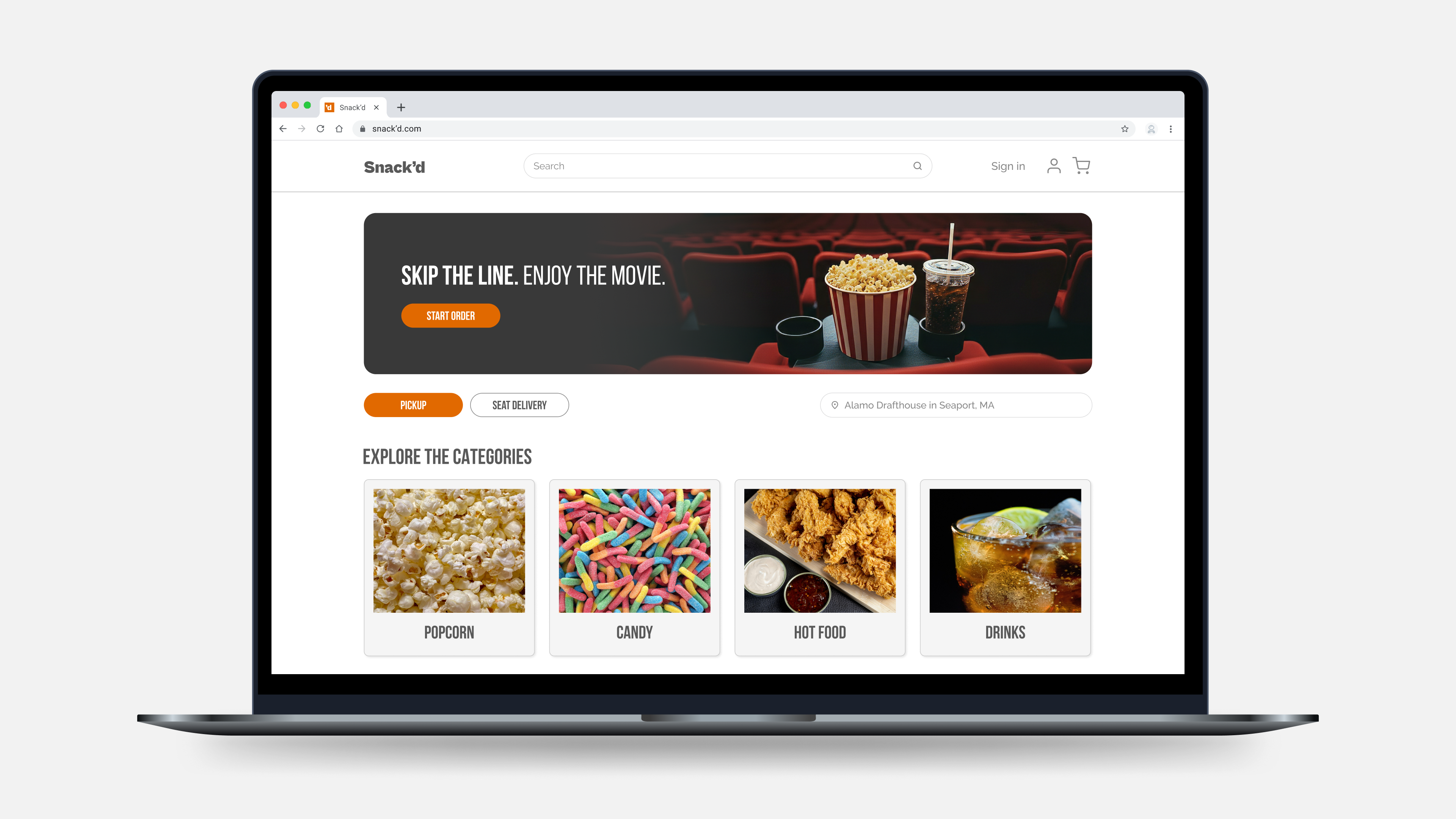
DESKTOP HOMEPAGE
Design Focus
For this project, I focused on areas that are especially important in a desktop experience such as clear site structure, intuitive navigation, and responsive layouts that adapt to smaller screens.
Key User Needs
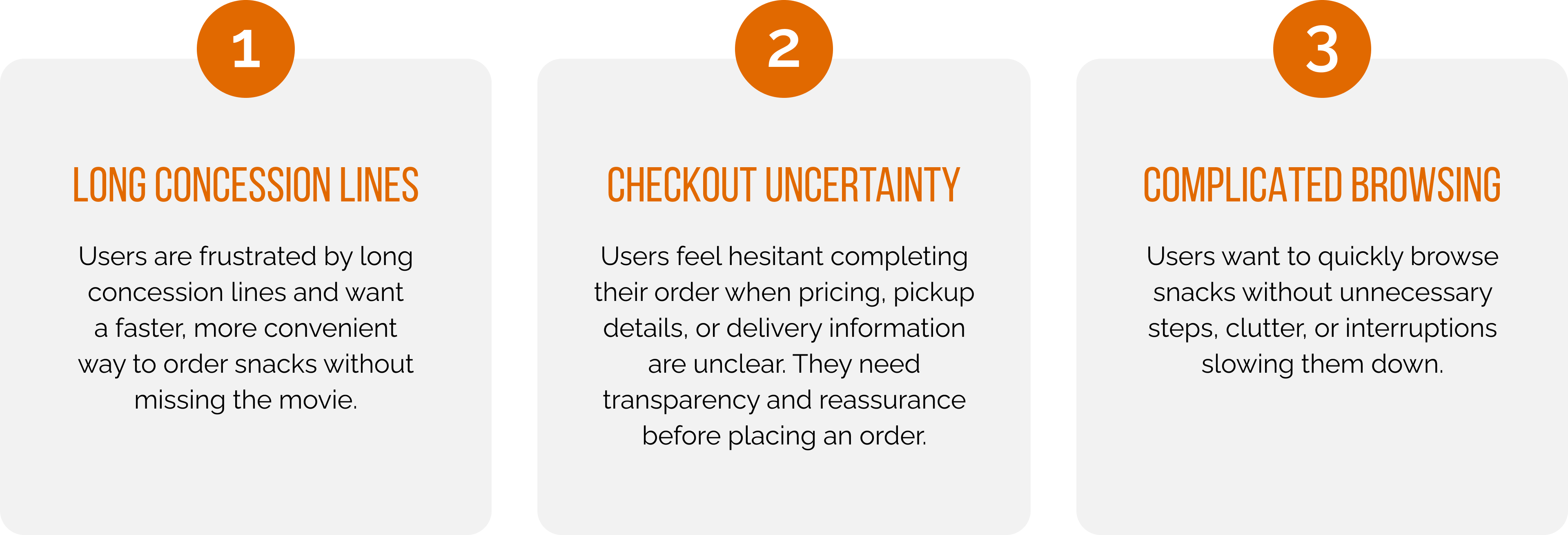
Through user research and usability testing with frequent moviegoers, I identified key pain points around long concession lines, unclear ordering flows, and lack of confidence during checkout.
These findings helped to inform decisions around hierarchy, layout, and information placement on desktop.
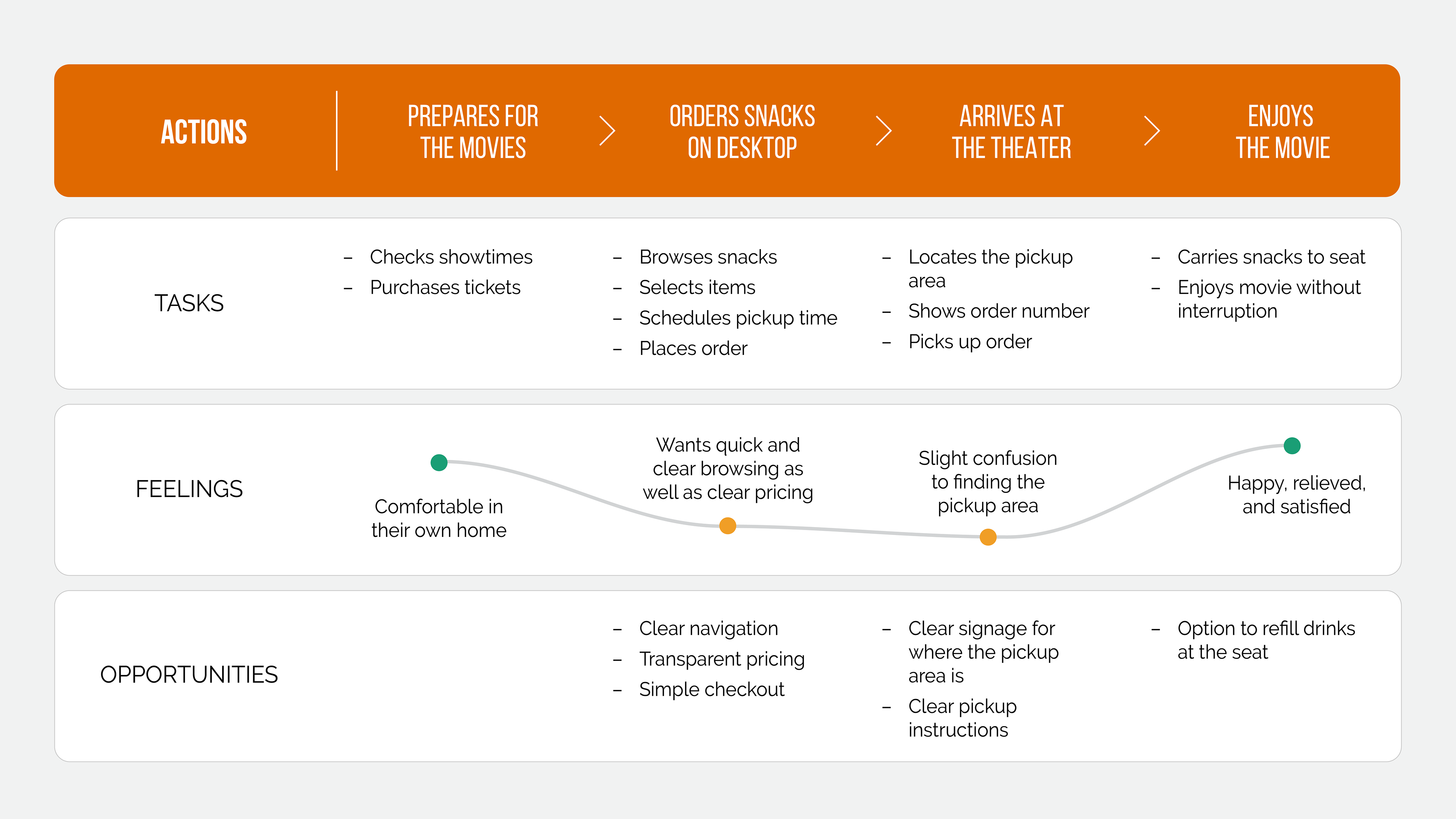
User Journey Mapping
To better understand the complete user experience, I created user journey maps for the personas developed through user research. The example below highlights the pickup experience, capturing the full journey and identifying user feelings, frustrations, and opportunities to improve the ordering experience.
DESKTOP PICKUP ORDERING FLOW
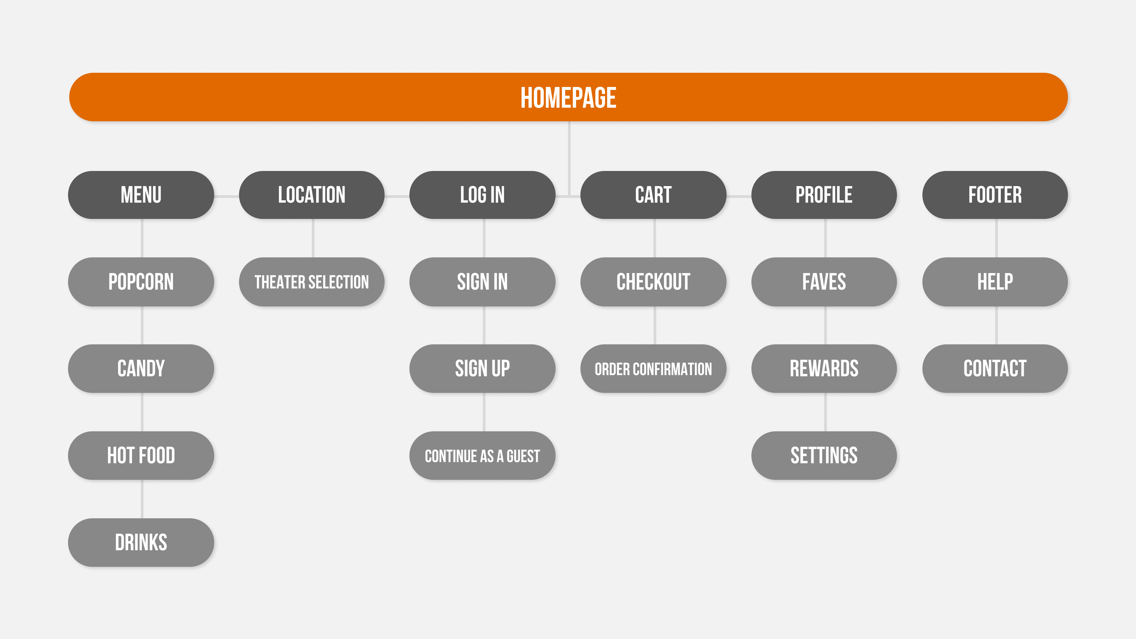
Information Architecture
Before designing any screens, I mapped out the full site structure to make sure users could get from landing on the site to completing an order without any backtracking or confusion.
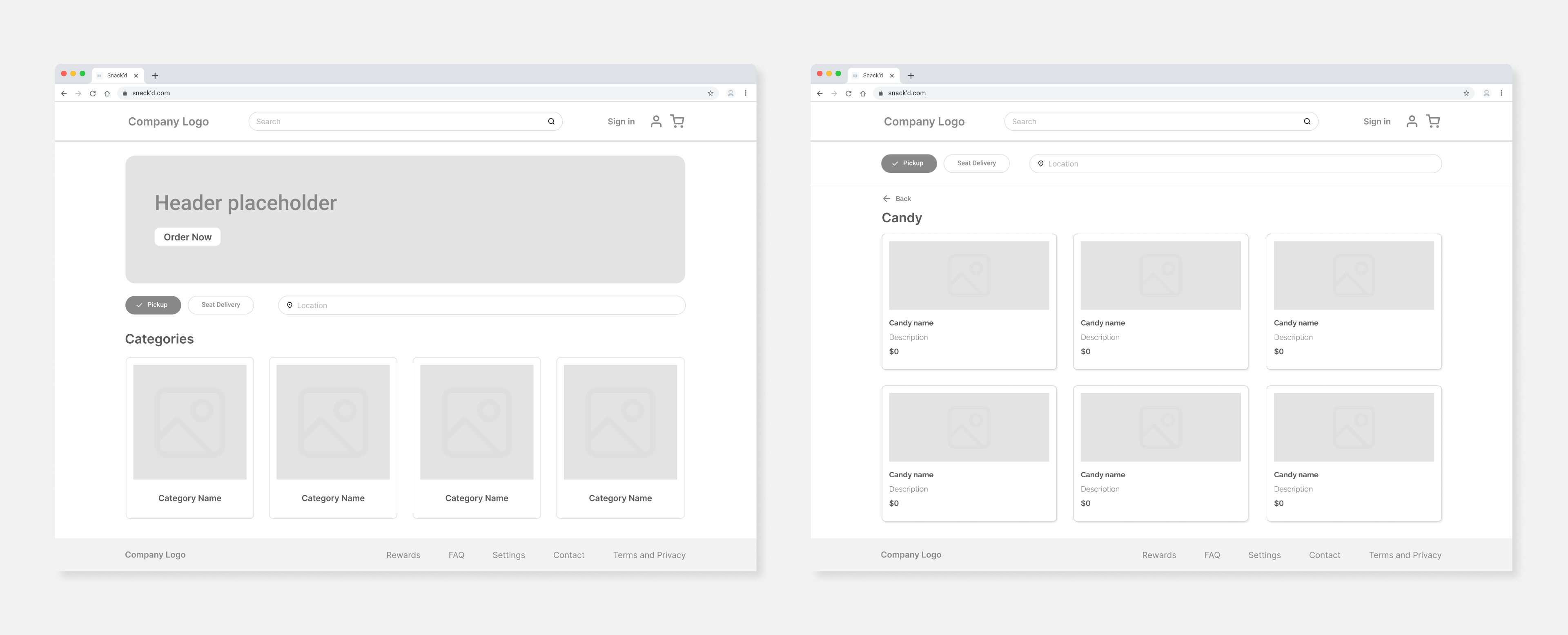
Wireframing and Layout Exploration
I explored multiple layout options to determine how product categories, item details, and cart actions should appear on desktop.
Wireframes helped identify where elements should be placed and where layouts could be simplified.
Responsive Screens
Snack'd was designed desktop-first, then carefully adapted for mobile. The goal was to make sure the experience felt just as simple and clear on mobile.
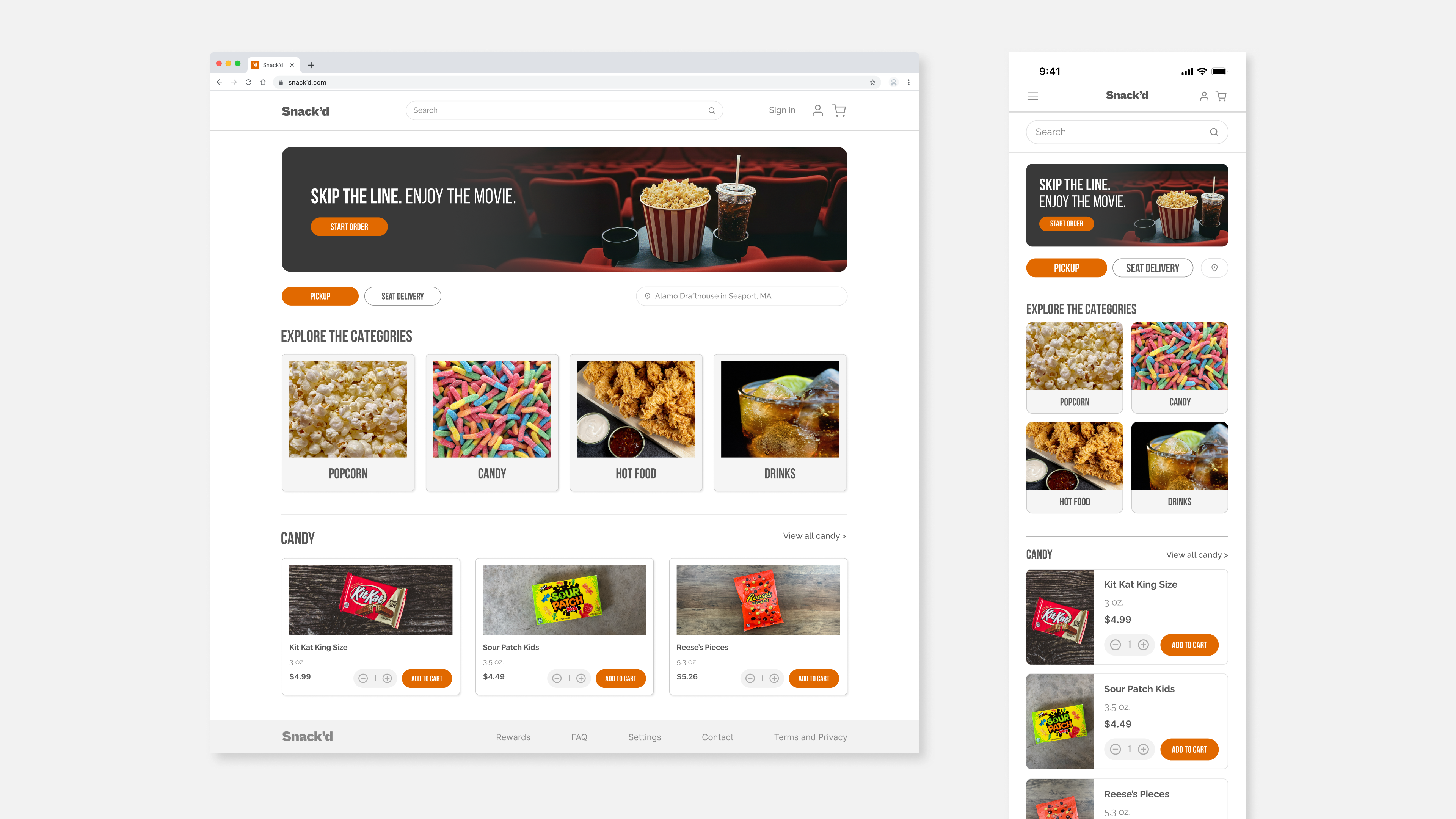
Final Design
The final design provides a clear flow for the user’s ordering experience.
Users can confidently browse categories, add items, and complete their order with minimal friction.
Accessibility considerations such as clear visual hierarchy, readable text sizes, and color contrast were incorporated to support a wide range of users.
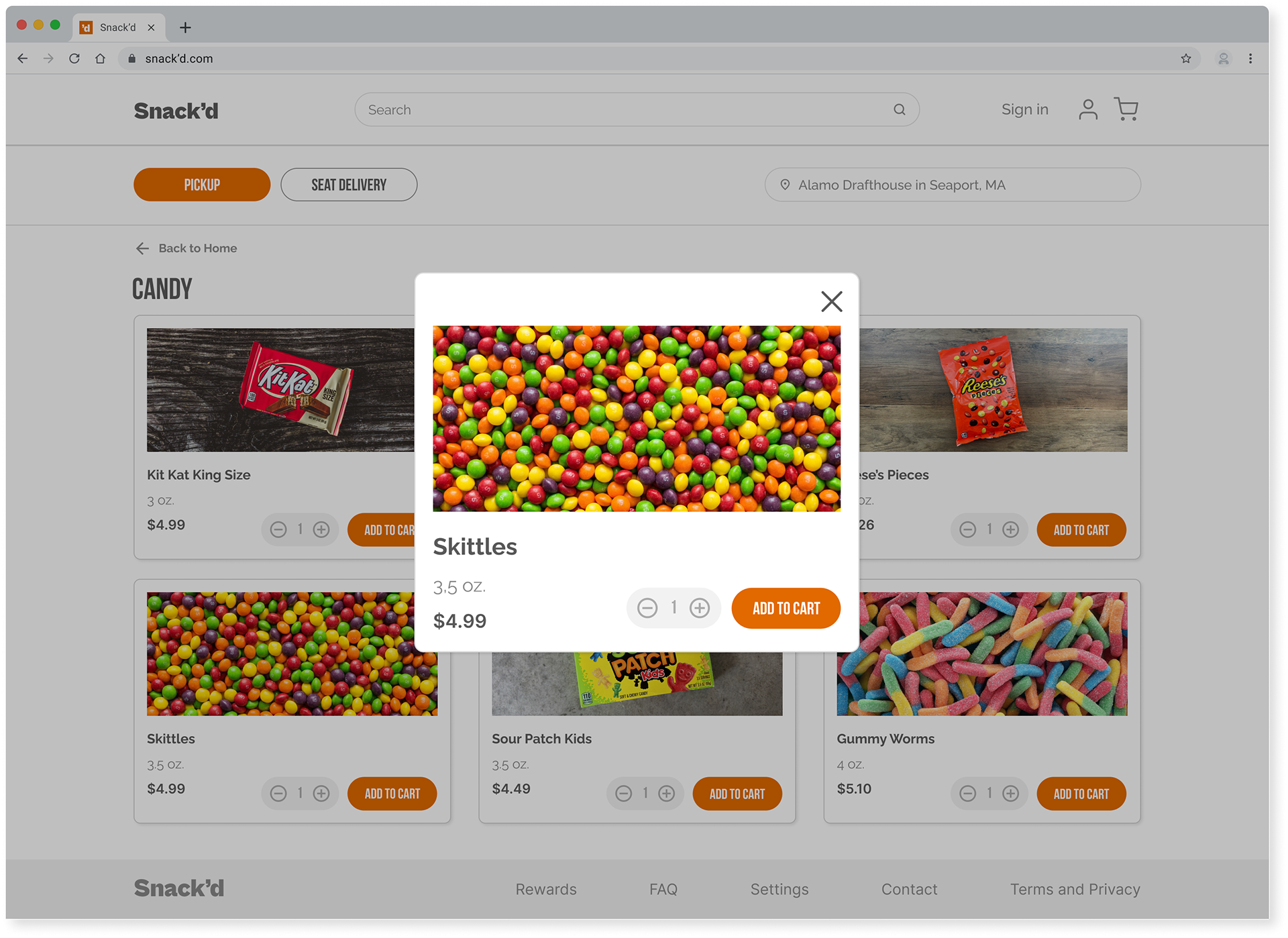
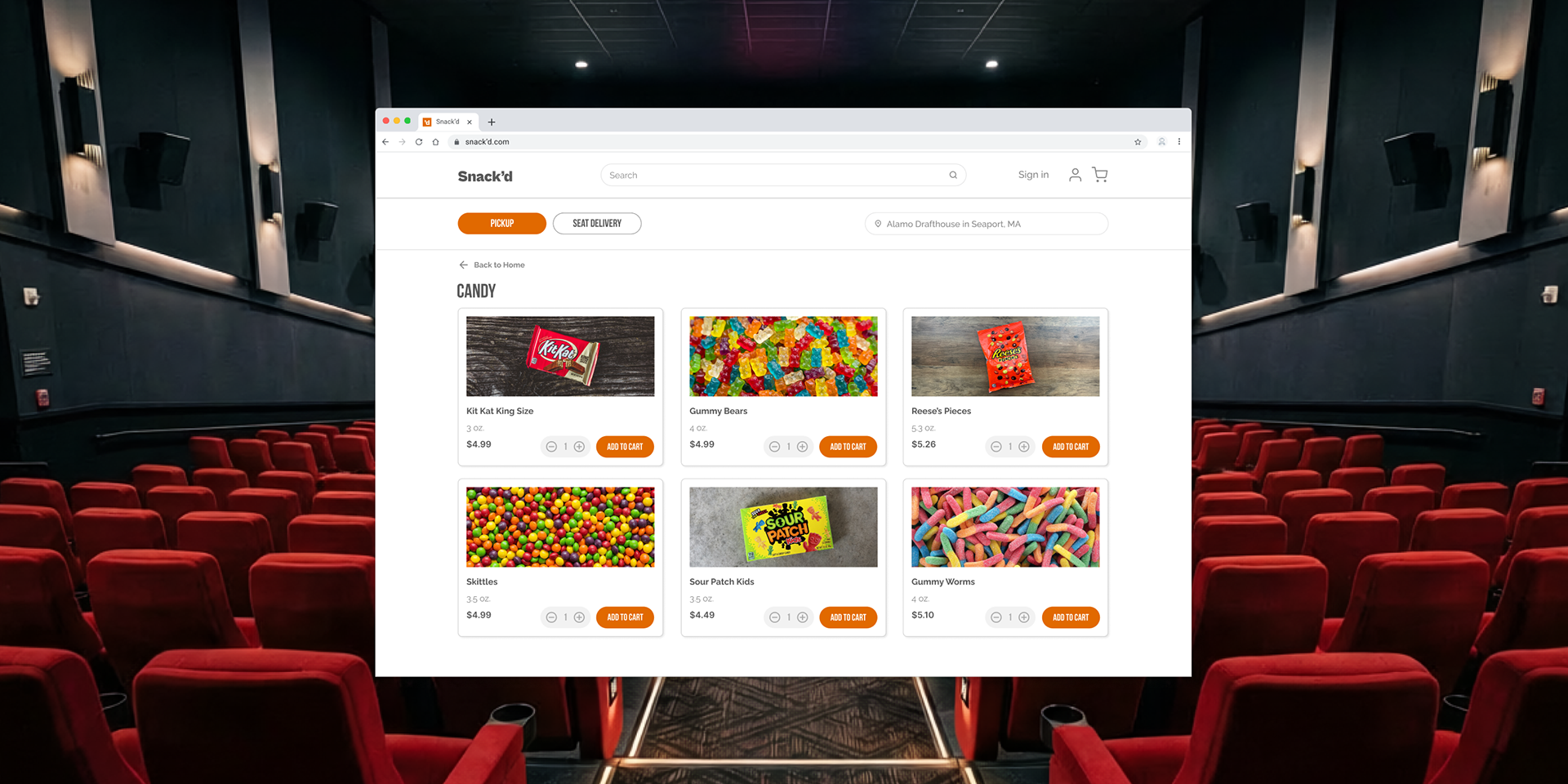
CANDY CATEGORY
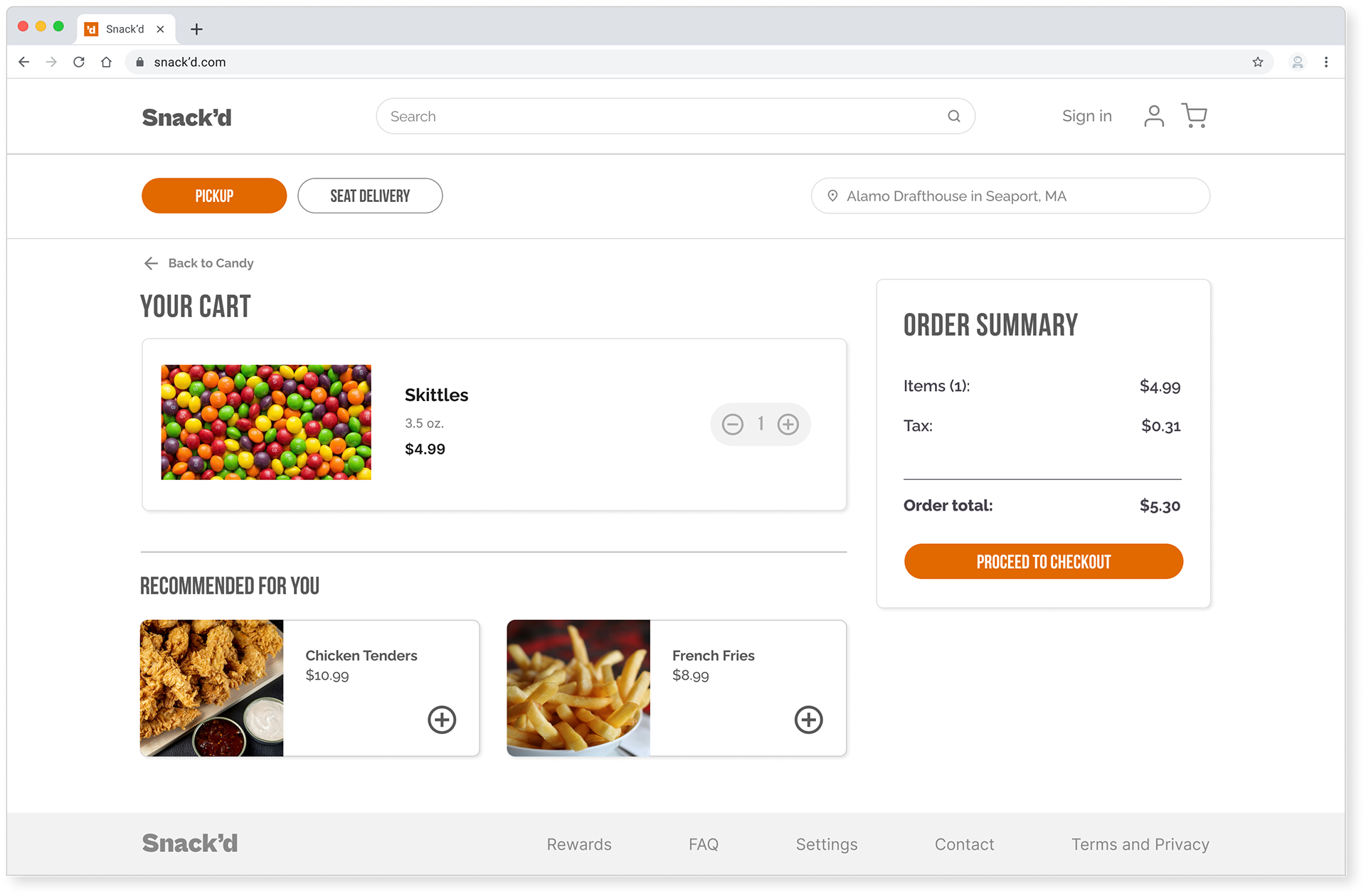
CART
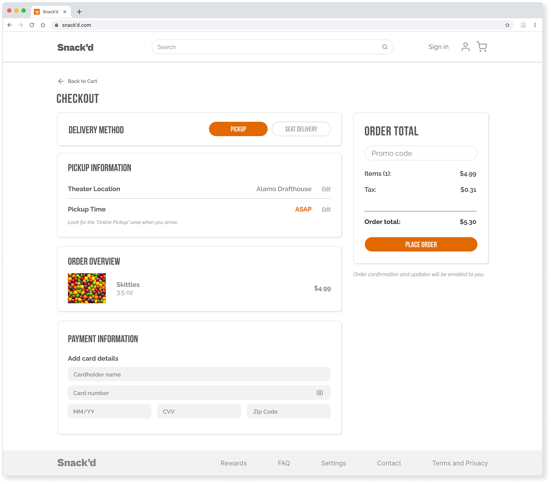
CHECKOUT
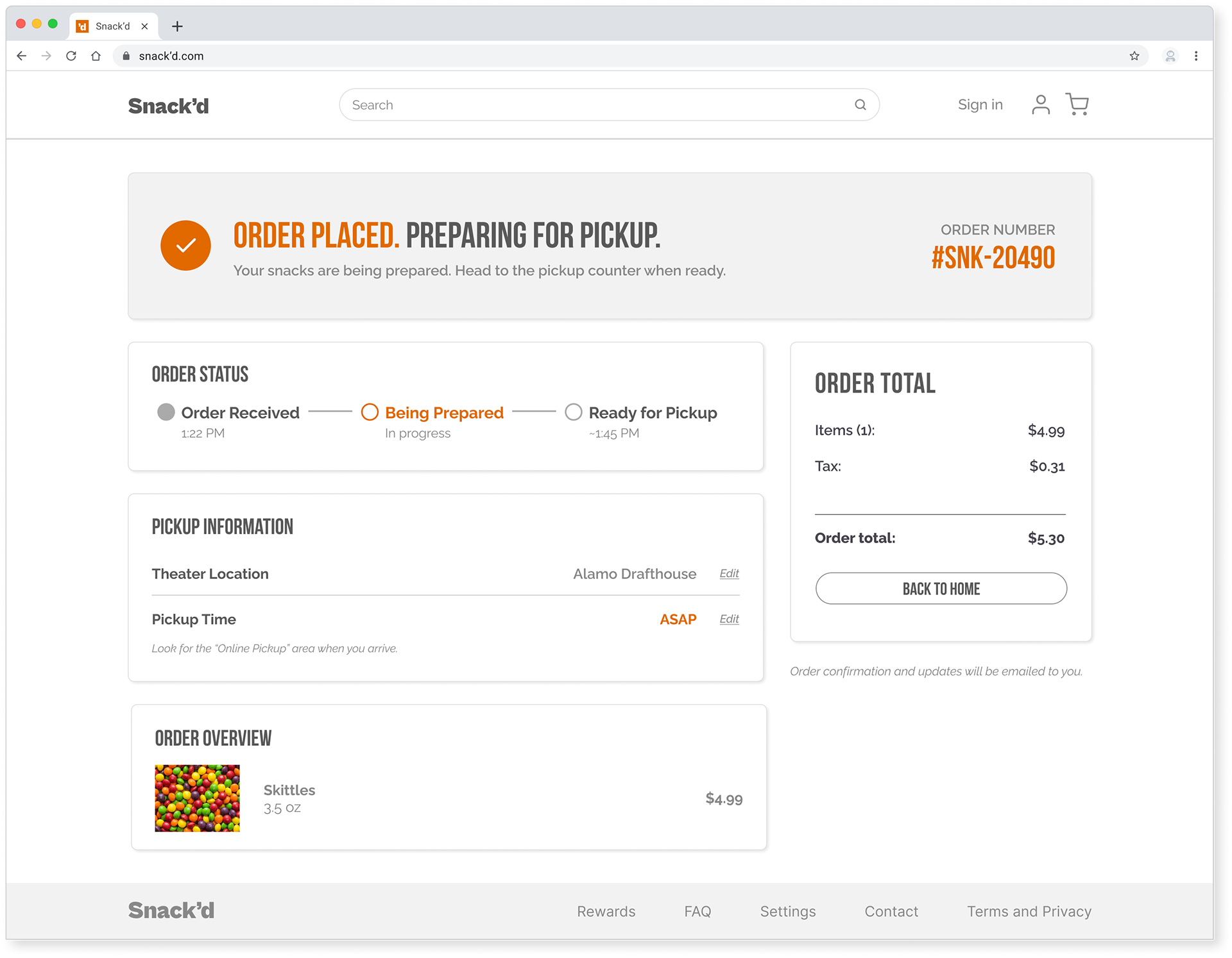
ORDER CONFIRMATION
What I Learned
Designing desktop-first taught me that having a clear structure makes everything else easier. When the hierarchy is clear and the layout is intentional, responsiveness follows naturally.
It also reinforced something I kept coming back to throughout this project: users don't just want speed, they want to feel confident in the ordering process.
By prioritizing transparency and simplicity, the final design increases confidence, supports faster decision making, and reduces frustration during the ordering process.